Figs Fungi
Branding + Packaging
Skills Used
Graphic Design
Creative Direction
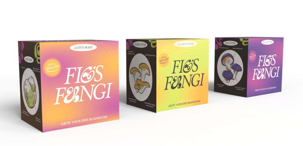
I was approached by Fig’s Fungi to come up with a brand that was based in science but also alluded to the hippy side of mushrooms. Most of the logo mark is made up of a typeface that is reminiscent of iconic, beautifully illustrated vintage science posters. The detail of the illustrated elements also alludes to that.
The hippy side of things comes through with the flowing gradients and wonky custom lettering. I chose to keep the hippy side a bit more subdued to help the brand retain trust in the mycological industry.